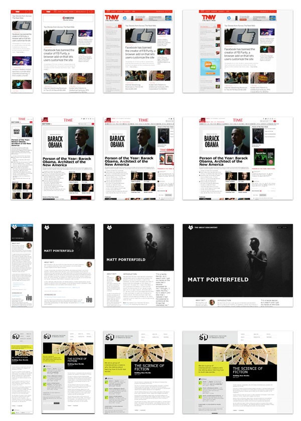
When a website is responsive, the layout and/or content responds (or, adapts) based on the size of the screen it’s presented on.
A responsive website automatically changes to fit the device you’re reading it on.
Typically, there have been four general screen sizes that responsive design has been aimed at: the widescreen desktop monitor, the smaller desktop (or laptop), the tablet, and the mobile phone.
As you can see in the examples below, as the screen gets smaller, the content shifts and changes to the best display for each screen …
Why should I care about mobile responsive design?
In short, you (the digital publisher, developer, and designer) should care because you want the visitors to your website to have the best experience possible, without forcing them to adapt themselves.
There are essentially two ways you can give your audience a good experience utilizing responsive design:
1. Optimize the layout of your content.
If a reader is browsing your site from a mobile phone, they generally don’t have a lot of screen real estate to work with. Phones today will typically zoom out automatically, so that the entire website can be seen onscreen. This can be good, as it gives the reader access to the entire sight, but it can also be frustrating when trying to find information that is located in a tiny part of the upper right of the screen. If you could move some things around, make some things bigger, and not have as many columns, you’ll give your mobile reader a much better experience.
2. Adapt the content that’s shown.
If you own a restaurant and a potential customer is browsing your site from a mobile phone, chances are they aren’t that concerned with how pretty your site is — your foody blog with the awesome slideshow of delectable dishes scrolling from side to side isn’t very useful in that situation. They want to know what your hours are, where you’re located, how to make reservations, and want a look at your menu.
Your potential customer browsing from a desktop computer probably isn’t looking to eat right now, and isn’t in a hurry to see where you’re located and what your phone number is. Most likely, he’s looking to see if you offer a good atmosphere and what kind of food is available.
These are obvious generalizations, but you can see the benefits of having differing content presented to people in different screen viewing circumstances.
Mobile responsive design takes care of this “on the fly”, and without multiple versions of your site to maintain.

